Line Plot – Definition with Examples
Updated on January 11, 2024
Dive into the fascinating world of line plots with Brighterly’s comprehensive and easy-to-understand guide, designed especially for children! Our all-inclusive resource covers everything from line plot definitions and types to examples and practice questions that will help your little ones become proficient in this essential math skill. Discover the magic of line plots and embark on a fun-filled learning journey with Brighterly’s expert guidance!
Line Plot Definition
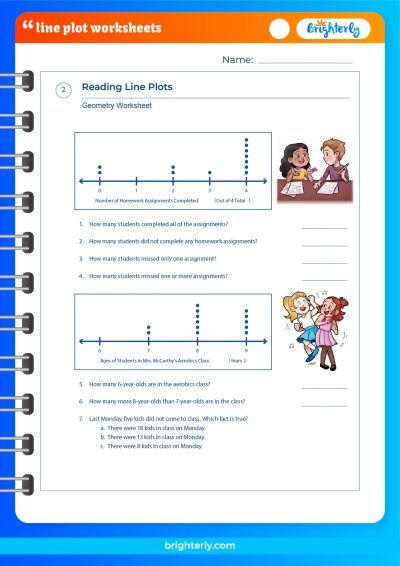
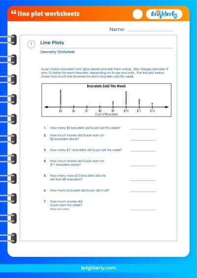
A line plot, also known as a dot plot or stem plot, is a simple way to display data along a number line. It involves placing small marks, such as dots or X’s, above a number line to represent the frequency of data points at different intervals. Line plots are particularly useful for representing smaller data sets and helping young learners understand the concept of data distribution, patterns, and trends.
To deepen your understanding of the concept of Line Plots, we recommend exploring the math worksheets offered by Brighterly. These worksheets are designed to aid in learning and reinforcing knowledge on this topic.
Line Plot Graph
A line plot graph consists of a horizontal number line that represents the range of values in the data set. Above the number line, data points are marked using dots or other symbols to show the frequency of each value. The height of the marks above the number line indicates the frequency or count of each data point. This simple visualization allows children to quickly identify patterns, central tendencies, and outliers in the data.
How to Make a Line Plot?
Creating a line plot is a simple process that can be broken down into the following steps:
- Collect the data set that you want to represent.
- Determine the range of values in the data set and create a number line accordingly.
- For each data point in the set, place a mark (such as a dot, X, or other symbol) above the corresponding value on the number line.
- Observe the resulting line plot and analyze the patterns, central tendencies, and outliers.
Reading a Line Plot
To read a line plot effectively, children should focus on understanding the information it conveys. This includes identifying the range of values, the most common values (mode), and any noticeable patterns or trends in the data. By carefully observing these aspects of the line plot, children can develop a stronger understanding of the underlying data set and its implications.
Types of Line Plot
There are various types of line plots, each with its unique way of representing data. Some common types include:
Vertical Line Plot
In a vertical line plot, the number line is oriented vertically, with data points plotted along the y-axis. This format can provide a more visually impactful representation of the data and may be helpful for comparing multiple data sets.
Horizontal Line Plot
A horizontal line plot is the most common type of line plot, where the number line is oriented horizontally, and data points are plotted along the x-axis. This format is especially useful for smaller data sets and is typically easier for children to understand.
Straight Line Plot
A straight line plot is a variation of the line plot where data points are connected by straight lines to show trends or correlations between variables. This type of plot is more commonly used in advanced math and statistics to analyze relationships between continuous variables.
Different Parts of Line Plot
A line plot consists of several components that work together to represent data visually. These include:
- Number line: The horizontal or vertical axis that shows the range of values in the data set.
- Data points: Marks (such as dots, X’s, or other symbols) placed above the number line to represent the frequency of each value.
- Labels: Text labels that provide context and information about the data set, such as variable names or units of measurement.
- Title: A descriptive title that gives an overview of the data set and helps readers understand the purpose of the line plot.
Line Plot with Fractions
Line plots can also be used to represent data sets with fractional values. To create a line plot with fractions, follow these steps:
- Determine the range of values in the data set, including the smallest and largest fractions.
- Create a number line with tick marks representing each fraction in the range.
- Plot data points above the corresponding fractions on the number line, using symbols such as dots or X’s.
- Analyze the resulting line plot for patterns, central tendencies, and outliers.
Line Plot Examples
To help reinforce the concept of line plots, here are some example scenarios where line plots can be useful:
- Representing the number of books read by students in a class each month
- Tracking the number of minutes spent on daily exercises
- Visualizing the distribution of scores on a test or quiz
- Comparing the number of goals scored by different players in a soccer league
Practice Questions on Line Plot
Here are some practice questions to help children apply their understanding of line plots:
- Create a line plot to represent the following data set: 2, 4, 4, 6, 7, 7, 7, 8, 8, 9
- Identify the mode of the data set represented in the line plot created in question 1.
- Create a line plot with fractions for the following data set: 1/2, 3/4, 3/4, 1, 1, 1 1/4, 1 1/2
- Interpret the line plot created in question 3 and identify any patterns or trends in the data.
Frequently Asked Questions on Line Plot
Here are some frequently asked questions about line plots and their answers:
What is the difference between a line plot and a bar graph?
While both line plots and bar graphs represent data visually, they serve different purposes. Line plots are ideal for displaying smaller data sets and showing the distribution of data points, whereas bar graphs are better for comparing data across categories or time periods.
When should I use a line plot instead of a histogram?
Line plots are best for smaller data sets with discrete values, while histograms are more suitable for larger data sets with continuous values. If you need to represent the frequency distribution of a continuous data set, use a histogram.
Can I create a line plot with negative numbers?
Yes, you can create a line plot with negative numbers. Just extend the number line to include negative values and plot the data points accordingly.
Information Sources
For more information and resources about line plots, consider visiting the following websites:


