Graph – Definition, Types, Practice Problems, Examples
reviewed by Jo-ann Caballes
Updated on November 12, 2024
There are several ways to represent data in order to make it easier for us to interpret. Graphs are one of them.
Here, we give the definition of graph, graph examples, and explain the various types of graphs for math, all of which are necessary for building a good foundation in statistics.
What is a Graph?
A graph is a visual representation used to express data and mathematical values. It can also show the relationship between different datasets in an organized manner. But, what does a graph mean?
Graph: Definition
We may define a graph as a diagram that showcases and represents data. Through graphs, complex information can be simplified, processed, and understood in a visualized format.
Graphs are necessary because they can help us process and make sense of voluminous data and with graphs, we can make informed future decisions.
Graph example
Let’s consider one graph example. In a classroom, every student is asked to select their favorite fruit: 6 students chose the apple, 2 students chose kiwi, 3 students preferred grapes, and 4 students said that banana was their favorite fruit.
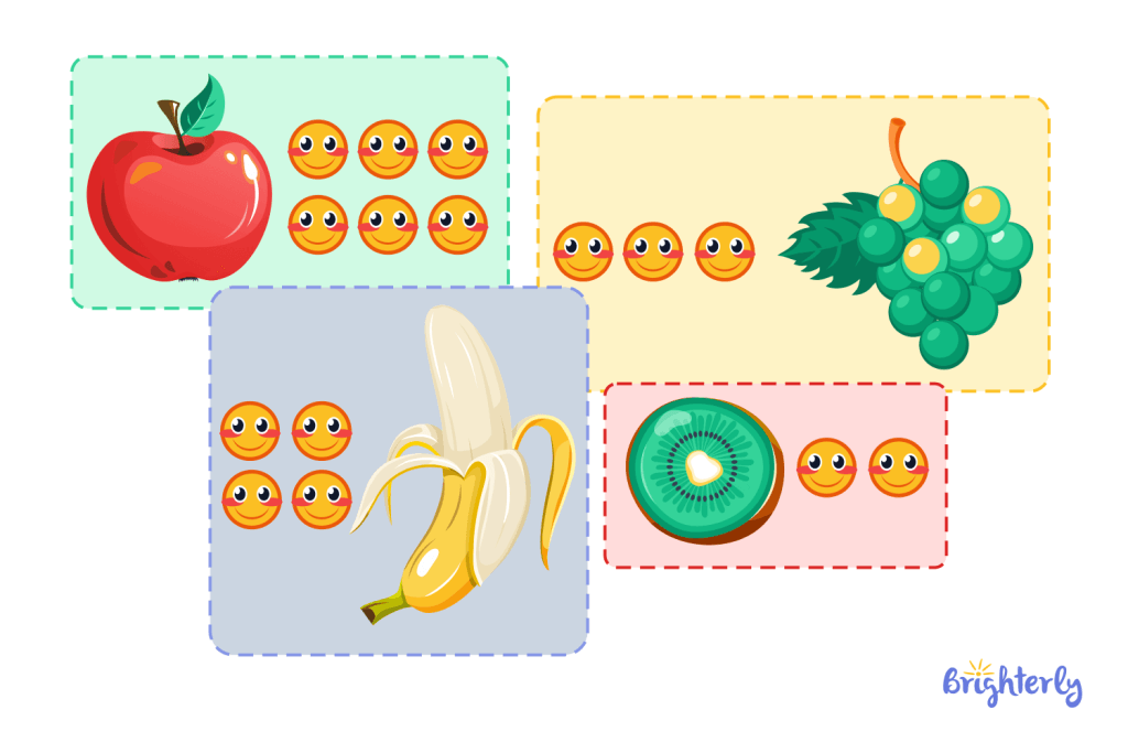
Understanding each detail in the statement may be a bit difficult but when visualized as a graph,
we can easily say that the fruit most students have as their favorite is the apple, followed by banana, grapes, and finally kiwi. We can also tell the amount of students that prefer each fruit.
The example of graph we used above is a pictograph, however, the data given can be represented in other types of math graphs. Let’s look at some of them below.
Expert Math Tutors for Every Level
Connect with professional and certified educators who provide specialized support for every grade level, from elementary school basics to advanced algebra
Types of graphs in math
Pictograph
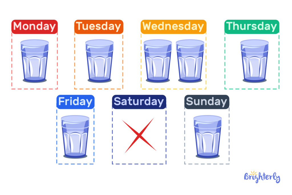
Pictographs are the expression of data through pictures. For instance, to showcase the amount of milk drunk in a week, we may represent it in a graph using glasses of milk and the days of the week. We can also put multiple glasses of milk to show each day where more than one glass was drunk.
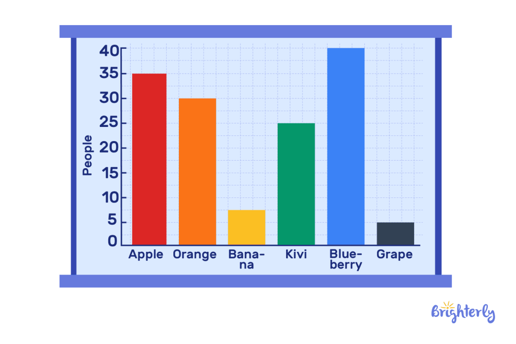
Bar Graphs
A bar graph is used to express data in rectangular bars. Plus, these bars could be horizontal or vertical in shape and they don’t touch each other, instead, they have an equal amount of space between them. The kind of graph where the bars touch each other is the histogram.
Bar graphs can be used to interpret data easily when the data is about comparing the level or amount of one element to another with the longest bar being the highest.
Bar graphs always have an x-axis and a y-axis. The x-axis is horizontal and is used to represent groups or categories, while the y-axis is vertical and shows the corresponding frequency.
For example, if we were to give two examples of units that can be used on a graph, we can put fruits on the x-axis and the number of people that consume the fruit on the y-axis as is in the image below:
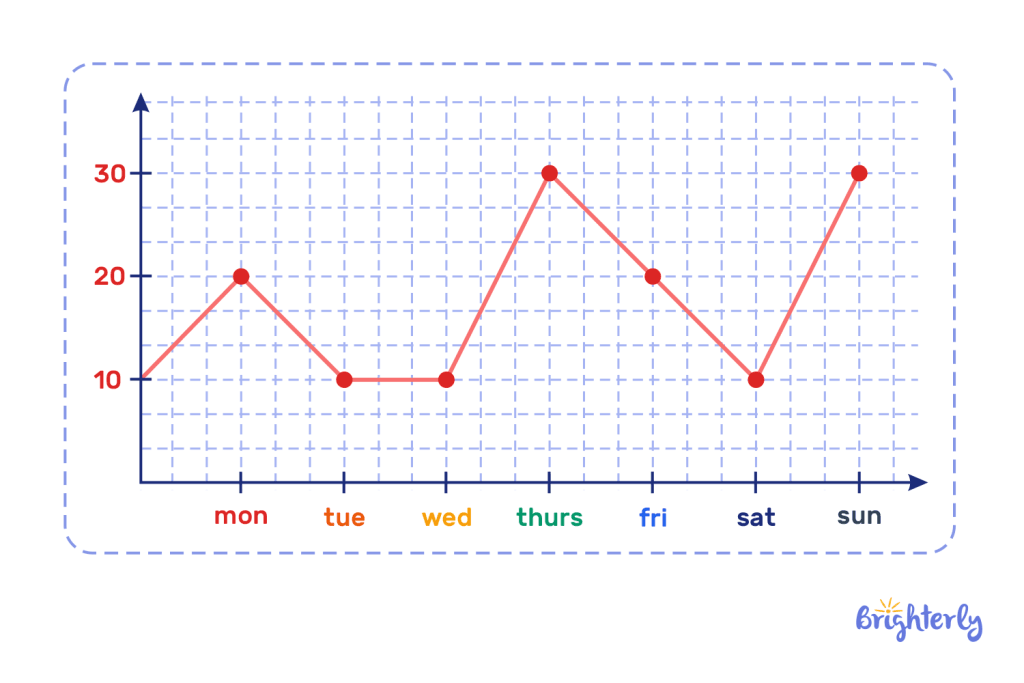
Line Graphs
This type of math graph is a set of dots used to express the value of given elements, after which a line is drawn through the dots to show a trend or change that happens over time.
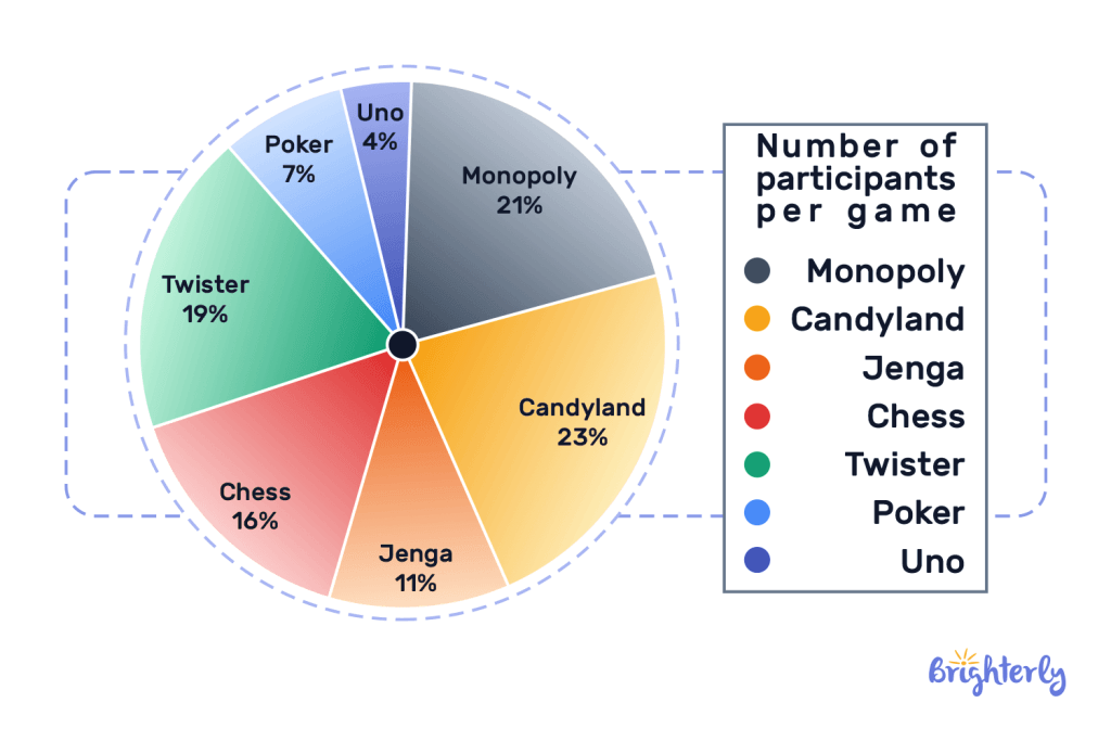
Pie chart
Just like a real pie, a pie chart is a circle diagram divided into sections: each section showcases the relation of that section to the entire percentage of the pie. For instance, with the math graph below, we can tell the percentage of people playing what types of games, and from this chart candyland has the largest slice of the pie.
What do the graphs show?
Graphs for math are used to show data, which can be expressed through different types of graphs — each demonstrates unique relationships between the data through various designs. Here is what each graph type shows:
Pictographs report specific or distinct data and are expressed with pictures such as the amount of milk drunk in a month.
Bar graphs depict the comparison between different datasets and make identifying differences easier through the rectangular bars.
Line graphs visualize developments, trends, and changes and are represented with dots connected to form a line.
Pie charts show the relationship between a part and the whole. It is expressed using a circular diagram divided into sections.
Please note that graphs are generally used to illustrate data and different types may show the same data but the representation may be more suited to one type over another.
Solved Math Tasks: Examples
Solved math problem 1
The below bar graph shows different types of activities that children partake in once they get home. Read the bar graph and answer the following questions:
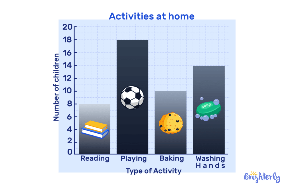
- Which activity do most of the children do at home?
- How many students take part in baking?
- Which activity has the least amount of participants?
- Is it true that 10 children took part in washing hands?
Answer
|
Solved math problem 2
The below pictograph shows the number of hours Jimmy spends on various activities in a day. He wants to know if he spends his time well so he needs you to answer the following questions. Note that each hourglass pictured in the graph is 2 hours:
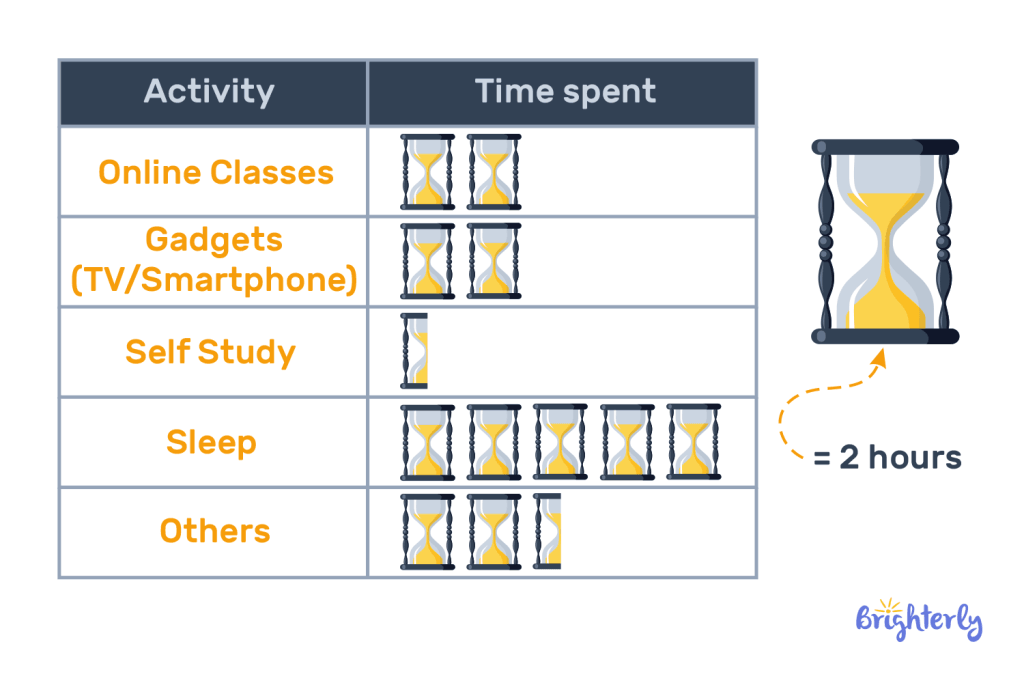
- How many hours does Jimmy use for his gadgets?
- What does Jimmy spend most of his time doing?
- What does Jimmy spend the least amount of time doing?
- How long does Jimmy do his online classes and self-study?
- How many hours of the day does Jimmy dedicate to other activities?
Answer
|
Graph: Practice Math Problems
Graph: worksheets
Children may not understand what a graph is used for. In this article, we define graphs, explain the types, and give relevant examples so your child can realize the importance of graph in math. We also offer free worksheets to improve your child’s knowledge on the subject:


Need help with Geometry?

- Does your child need additional support with understanding geometry lessons?
- Start lessons with an online tutor.
Choose kid's grade
Is your child finding it challenging to understand the basics of geometry? An online tutor could be the answer.
Book FREE lesson